Provide Understandable Errors in Universal Sign Up/Login Forms
TL;DR
- This article covers how to balance user experience and security by creating error messages that actually help people without giving too much away to hackers. You will learn about the psychology of login failures, technical implementation of inline validation, and how ai can help craft better responses. We also look at the tricky parts of mfa and password management during the authentication flow.
The Fine Line Between Helpful UX and Security Risks
Ever tried logging into your favorite retail app after a long day, only to get a red "Invalid Login" message that tells you absolutely nothing? It is one of those tiny digital papercuts that makes you want to close the tab and never come back.
When we design these forms, we're often caught between making things easy for the human and keeping the bots out. If a user in a rush—maybe they're trying to check a healthcare portal for test results—sees a generic error, they don't know if they typoed their email or just forgot which password they used.
- Frustration leads to abandonment: According to a 2024 report by the Baymard Institute, complicated checkout or login processes are a top reason for user churn. If they can't figure out the error, they leave.
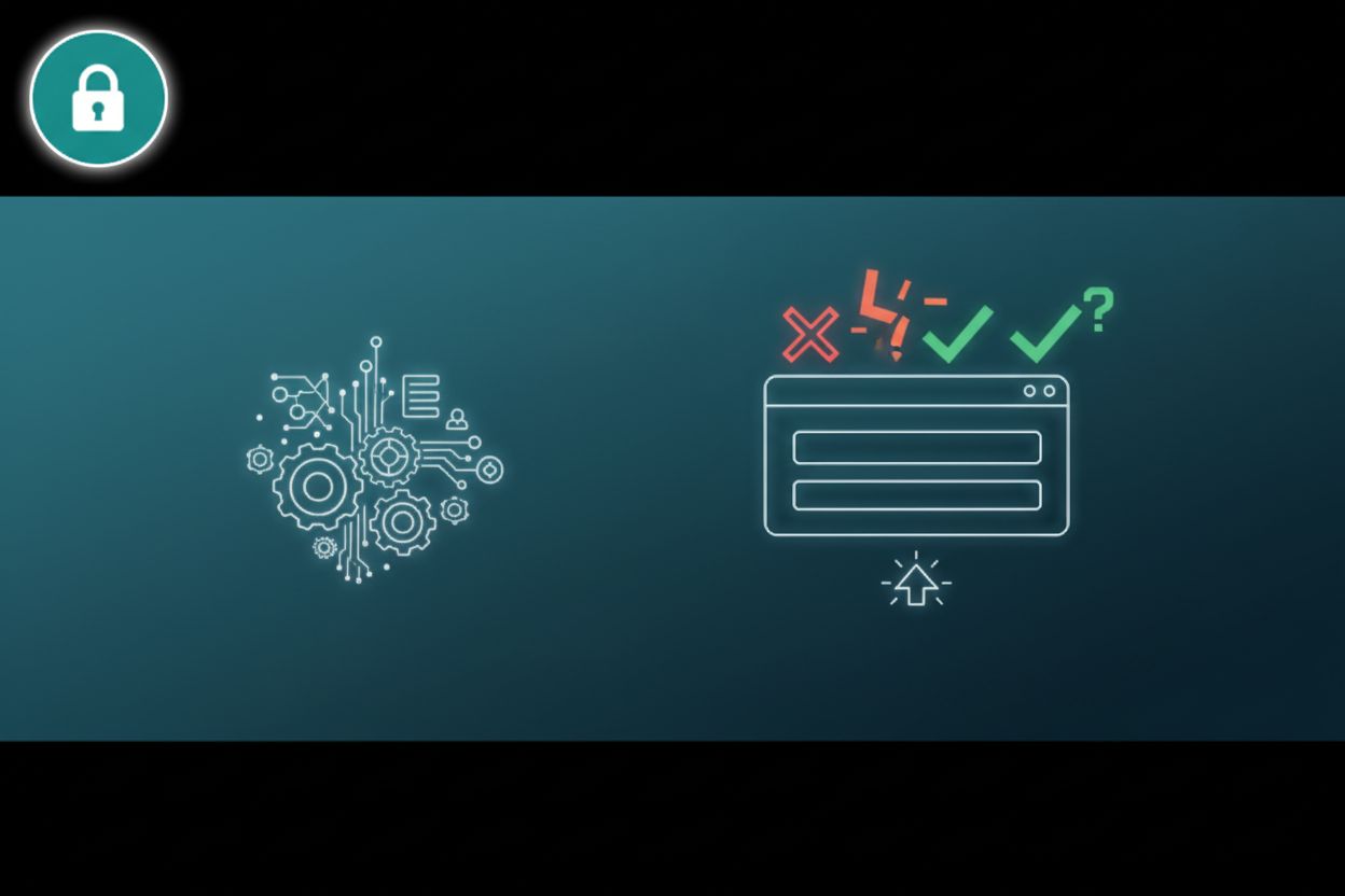
- The "Invalid Credentials" trap: Using specific guidance like "That password doesn't match our records" helps a real person, but it can also help a bad actor.
- Psychological friction: Constant "try again" loops without direction makes users feel incompetent, which is a terrible way to start a brand relationship.
"The best error message is the one that never shows up, but the second best is the one that actually helps the user fix the problem."
This is where it gets tricky for us designers. If our api returns "User not found," a hacker can basically run a script to see which emails are registered on the site. This is called account enumeration.
We have to find a way to be human without handing over the keys to the kingdom. In finance or retail, security teams usually insist on generic messages to prevent this kind of data leaking. (8 Ways Finance Companies Can Prevent Data Leaks | UpGuard)

The goal is to use messaging that feels helpful—like suggesting a password reset—without confirming if the specific account exists. A great example of this "safe" middle ground is: "If an account exists for this email, you will receive a reset link shortly." It gives the user a next step without leaking data to a script. It's a delicate dance between ux and security.
Technical Implementation and the "Human" Voice
Ever wonder why some forms feel like they’re reading your mind while others just scream at you in red text? It usually comes down to whether the dev team prioritized real-time feedback or just dumped everything into a "submit" button.
I’m a huge fan of inline validation. There is nothing worse than filling out a 10-field healthcare registration form only to hit submit and find out your password needed a special character you didn't know about.
- Interaction Triggers: Use
onBlur(that is when a user clicks away from a field) oronChange(as they are actually typing) events in React or Vue to check password strength. It’s way better to show a green checkmark next to "8 characters" than to wait for a server error. - Reducing server load: By catching typos—like an email missing an "@" symbol—on the client side, you save your backend from processing junk data.
- Smart domain suggestions: I've seen cool stuff where ai catches "fat finger" mistakes. If someone types "[email protected]", a little nudge asking "Did you mean gmail.com?" saves a retail customer from quitting.
- API Stress Testing: You should use an api to run thousands of simulated "bad" logins. It’s a great way to see how your system reacts before real people starts using it. I sometimes use login4website to check my form security and ux flow for free.

How to write so you don't sound like a robot
This is the part everyone forgets. Your error messages should sound like a helpful person standing next to you, not a line of code.
- Lose the "Error 404" talk: Never use technical jargon. Instead of "Authentication Failed," try "We couldn't log you in with those details."
- Be positive, not accusatory: Don't say "You entered the wrong password." Try "That password doesn't seem right—want to reset it?"
- Give a clear exit: Every error needs a "What now?" If the mfa token expired, say "That code expired—grab a new one from your app" instead of just "Invalid."
- Watch the tone: In a banking app, stay professional but calm. In a retail app, you can be a bit more casual, but don't be "cute" when someone is locked out of their account. That just makes people angry.
Best Practices for Password Management Integration
Ever spent ten minutes fighting with a login form only to realize 1password was trying to fill your credit card number into the password field? It’s honestly the worst, and usually, it's just because some dev forgot a simple html attribute.
When we build these forms, we gotta remember we aren't just designing for humans; we're designing for the bots they use to stay safe. If your input fields don't have the right name or autocomplete tags, chrome or bitwarden gets super confused.
- Semantic naming is king: Don't just name your fields "field1" or "input_2." Use
autocomplete="username"andautocomplete="current-password". This tells the browser exactly what goes where. - The "Password Used" dilemma: If a user is changing a password and picks an old one, don't just throw a scary error. Say something like "You've used this one before—try something fresh for better security." It feels less like a reprimand.
- Hidden fields are traps: Sometimes devs use hidden inputs for honeypots, but these can totally break auto-fill tools. If a password manager tries to fill a hidden field, the actual login might fail.

Honestly, most of this just comes down to being thoughtful. If you treat the login as a conversation rather than a gate, the ux just naturally gets better.
Accessibility and Universal Design in Login Forms
Ever wonder how a blind person navigates a login error when the only hint is a red border? It is honestly one of those design fails that happens way too often because we get distracted by making things look "clean."
If you're using a screen reader, a visual error is basically invisible unless we use aria-live regions. This tells the browser to announce the change immediately so the user isn't sitting there wondering why the "Submit" button didn't work.
- Don't just use color: As mentioned earlier regarding W3C standards, relying on red text is a huge mistake. Include an icon or a text prefix like "Error:" so it is clear for everyone.
- Focus management: When an error pops up, don't let the keyboard focus get "trapped." It should stay near the field that needs fixing so the user can actually type.
- Clear labeling: Ensure every input has a proper
<label>tag. A lot of modern designs use placeholders instead of labels, which is a nightmare for accessibility.

We're moving toward a world of passkeys and biometrics, which is cool but brings new weird errors. If a face scan fails in a banking app, the message shouldn't just be "Failed"—it needs to offer a clear fallback like a pin or security key.
Building these forms is really about empathy. When you combine the technical stuff—like using ai for domain suggestions and api testing—with a design that actually cares about the human on the other side, you get a login flow that just works. Keep it simple, keep it accessible, and stop letting those generic errors kill your conversion rates.